Page 2 - Physical Look - Outside
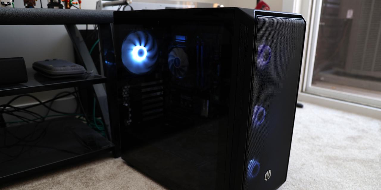
The most dominant feature of the NZXT Source 220 is its dark black color scheme, which blends in very smoothly with the metal mesh. One major difference over the Source 210 Elite is the usage of mesh over the front instead of a hard plastic cover. While it retains the same overall design, it offers improved airflow, yet holds onto the very simplistic look. The build inside this chassis will be sporting a nice Sandy Bridge based build in my basement, and just like its predecessor, an average person would probably look at it and think it is some generic computer. This is commonly referred to as being a 'sleeper'. The one thing I love about these mid-tower cases is that they offer tons of room, and are built to handle almost any kind of basic hardware. While customization might be a nice thing to have, you are really out of luck with the Source 220, because unlike the Source 210 Elite, it only comes in one color.
It seems I will be disappointed again; the width of the Source 220 is a bit underwhelming. At only 195mm wide, it leaves only 160mm for CPU heatsinks. For those who have large aftermarket coolers like the Noctua NH-D14, it will turn out to be a very tight fit. However, I would be wondering why you would spend more money on a CPU cooler than you would on a chassis. This chassis comes in at a height of 450mm, which happens to be 10mm taller than the Source 210 Elite. This is a relatively large difference between the two, but unless I was carefully looking, I probably wouldn't notice the difference in height. The depth is 495.5mm, which is on the lower end of where I would expect to find an ATX chassis -- but certainly nothing you would call restrictive. Here is the real treat. At 14.3 pounds, it is fairly light for an ATX case. This means you can move it around without feeling like you are trying to move a dead body. Just like its predecessor, this chassis is designed to be simplistic and minimal, so don't be shocked if you feel a little empty when looking at it.
The front panel of the NZXT Source 220 has a plastic cover mixed in with metal mesh. The panel can be removed easily by pulling outwards along the bottom. The best feature provided with the front panel is that it allows for excellent airflow, but you will have to ensure it is not located in a dusty place, otherwise, you will be regretting it. You can see in the picture above, this case supports up to three 5.25" drive bays to suite your needs. I happen to employ only one of them, which is perfectly fine for me, since I rarely ever use optical drives anyway. I do like the simplistic button arrangement for the power and reset buttons on the front; unfortunately, I will probably never use them as I'll be using Wake-on-LAN. Looking below the three drive bays, you will find there is room for two 120mm fans; not included. While I am very happy for the metal mesh, NZXT really should be using dust filters because of the sheer size of this gaping hole. I figure they will add dust filters, raise the price by $10, and call it the NZXT Source 230. Of course, if NZXT does this, then I really think they should send me one to review.
Taking a close look at the front panel, you will see the connectors along the top. It features a USB 3.0 port, USB 2.0 port, microphone jack, and a headphone jack. Typically, you would expect to find the power and reset button also around the front I/O panel; the NZXT Source 220 pulls a rolling dodge to the left, and places the power and reset button just below the three drive bays. This is a move that I feel was necessary, because of the slanted front style. I like how the ports are located at the top of the front panel, as I typically use them more often than the power and reset switch. However, in Australia, I think they might prefer it the other way around, but good thing we aren't in Australia. The power button has an LED light around it, lighting up with a bright gray-blue color, and is totally awesome. In addition to the power LED on the front, you can find the hard drive indicator LED just below, which lights up in a similar color.
Checking out the back side, you will find metal covers instead of rubber grommets, which you will have to remove for either water cooling or external cables. On the plus side, the USB 3.0 cable is located on the inside of the chassis, thus eliminating the need for you to have any cables running out the back. NZXT provides you with the rubber grommets out of the box, should you choose to use them. All that is required on your part is removing the metal covers and inserting the grommets. On the back, you will find a 120mm exhaust fan beside the motherboard I/O panel. This is fairly typical of most computer cases, and doesn't come in as a surprise. Looking a bit further down, you will find seven expansion slots for various parts, such as graphic cards. The slot covers are not sheets of metal, and are instead covered with a metal mesh. The bad news is this simply means you have more places for dust to enter, and it provides minimal additional ventilation. Finally, looking all the way down to the bottom, which is challenging for a tall guy like me, you can see a nice opening for the bottom mounted power supply bay.
The top of the NZXT Source 220 has two openings for top mounted fans. This means you can get lots of airflow at the top, but NZXT only provides you with a single 140mm fan. It is unlikely you will actually need two top mounted fans, so I am a bit unhappy with the size of openings at the top. All I can think about is how much dust is going to get inside of the chassis because of this particular design. For those who will end up utilizing the second fan position, you will most likely enjoy really good airflow around the CPU. The side panel also offers an opening for a side mounted fan; either a 120mm or a 140mm. I'm still trying to figure out why neither the Source 220 nor Source 210 Elite lists this in the specifications. The handy part about this opening is it is located low enough that aftermarket CPU coolers will not get in the way, and is adjacent to your graphics card(s).
Peering over the bottom, you can find a couple features of interest. Just like the Source 210 Elite, the Source 220 offers four rubber feet, with two near the front and two near the back. Honestly, four feet is really all you need for a lightweight chassis; any more would be pointless. The rubber feet do a good job at preventing the tower from sliding, as we all know, the last thing you want is a computer that can't hold its own ground. The bottom also has two fan openings; one for the power supply unit, and the other for an additional fan, in case you need more. While I admit the underside isn't the prettiest looking part of the chassis, if you compare it to looking up the skirt of a pretty girl, then I would not be expecting much in comparison. (Sigh. - Editor)
The NZXT Source 220 is very plain and simple on the outside, just like the Source 210 Elite. If you want to hook up a bunch of extra fans to provide better cooling for your system, then this case certainly offers that. I feel having just two fans in total is a bit on the lower side, but having a good mesh front will allow you to easily add more fans for drastic improvements in airflow. The exterior has nice rounded edges, eliminating the possibility of getting cut, and because of the simple rectangular shape, it is easy to pick up and move around. Overall, the outside is fairly respectable, and while it isn't that much different than the Source 210 Elite, the front meshing makes for a huge improvement.
Page Index
1. Introduction, Packaging, Specifications
2. Physical Look - Outside
3. Physical Look - Inside
4. Installation and Conclusion


